Implementing Dark Mode in your Flutter App.
Best Way to Implement Dark mode in your Flutter App using Provider and Shared Preferences.


Table of Contents
Prerequisites.
Provider and shared preference as it relates to this article.
Create ThemeScreen.dart file.
Add required dependencies.
Create the ThemeProvider class.
Add ChangeNotifierProvider to the root of your App.
Connect Theme logic to UI.
Conclusion
Introduction:
Changing an application’s theme from light to dark mode is a trending feature today, in the world of Mobile Apps. It saves battery life and protects the user’s eyes. Recent statistics show that its usage has increased dramatically, with a large number of people choosing darker themes on a variety of devices.
In this article, we shall look at how to implement a simple App that allows its users to switch between device settings, Light mode, and dark mode using Provider and Shared Preference. Let's dive right in.
Pre-requisite:
To properly follow through with this guide, you should have the following:
Basic knowledge of Dart and Flutter.
An understanding of state and state management.
Provider and Shared Preferences:
Provider is a state management tool that allows developers to carry out dependency injection very effectively. Get to know more about the provider package here. Shared Preferences allow the storage of lightweight data in key-value pairs to aid easy retrieval later. In this application, shared preferences will be used to persist data.
By the end of this tutorial, you should have a comprehensive understanding of how to implement dynamic theme switching, leveraging the 'provider package' for state management and 'shared-preferences' to persist user preferences in a Flutter app.
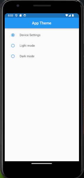
Creating the theme Buttons Page.
In your lib folder, create two files; themeScreen.dart and themeProvider.dart. In themeScreen.dart, create a scaffolded page using a Column, and add three RadioListTiles as its children: Device settings, Light theme, and Dark theme respectively.
By the time we’re done, our ThemeApp should look like this:
Add required Dependencies:
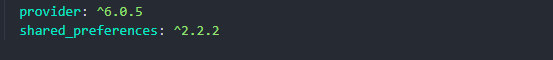
Add the provider and shared preference package to your pubspec.yaml file.
Create a Theme Provider Class
In your themeProvider.dart file, create a ThemeProvider class that extends the Change Notifier. In this class, we shall create two functions.
loadTheme() function: for loading the app's theme and,switchTheme()function: for switching between preferred themes.Shared preferences help us achieve these, by persisting data and saving the user’s theme preference. Hence, we use it to ensure that the application respects the user’s theme choice consistently across app sessions.
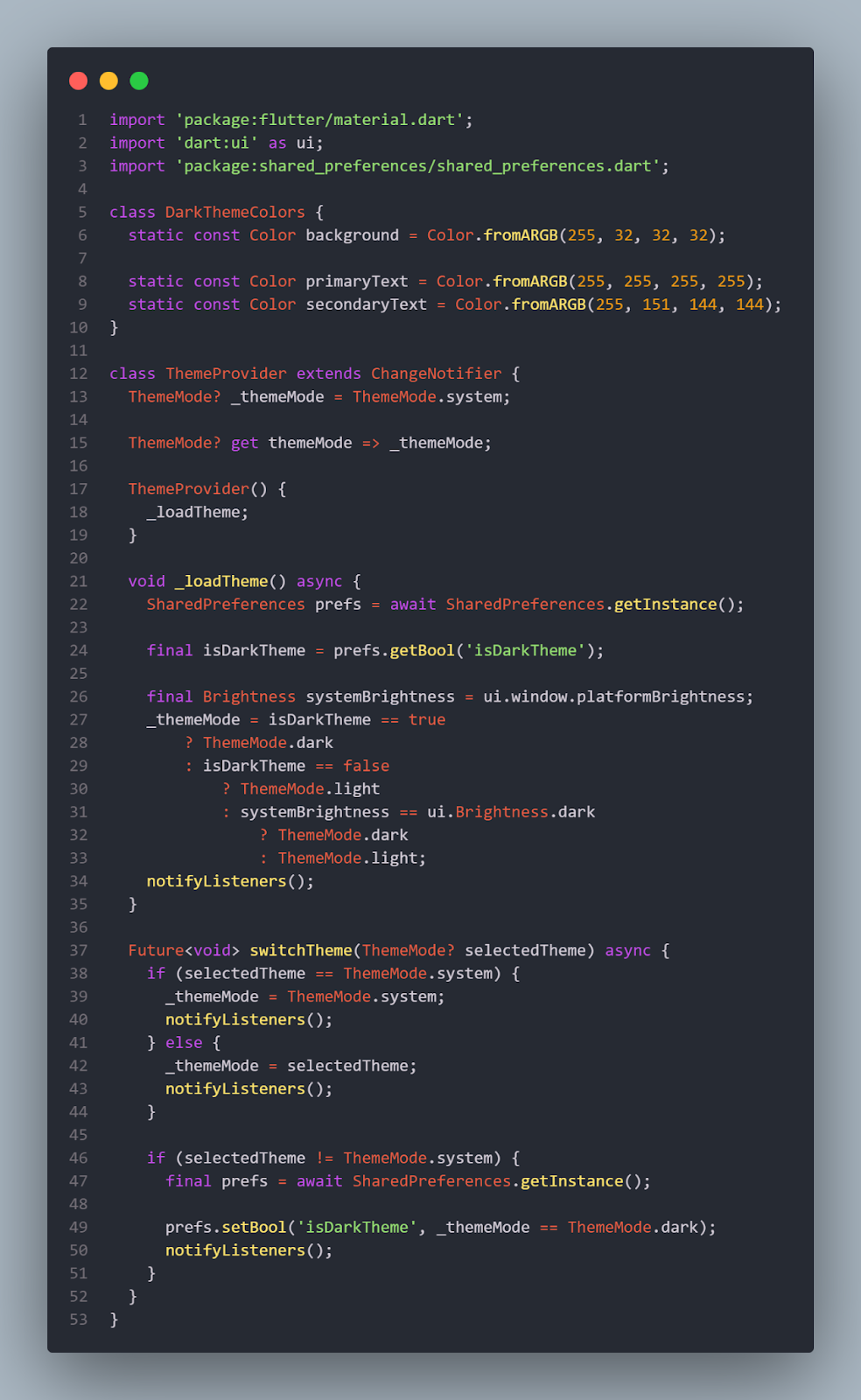
Let’s take a look at the ThemeProvider class:
DarkThemeColorsclass is used to define the colors for dark theme in our app. You can add your desired colors, it will come in handy in themain.dartfile.The first line of code in the ThemeProvider class declares a private instance of a variable _themeMode and then initializes it with a value-
ThemeMode.systemThemeMode.systemis the initial value assigned to _themeMode, it means that ThemeMode.system is the app’s initial theme mode, and it will be used until the user explicitly selects light or dark mode.ThemeMode.systemdescribes the theme of the application based on the user’s system preferences using the UI PlatformBrightness object. If the platform has no preferences, the Platform Brightness defaults toBrightness.light.The
loadTheme()function is called to retrieve the previously selected theme from shared preferences, when the application is reopened. ThenotifyListeners()method enables all listeners to perform the required action.Function
switchtheme()takes in a parameter calledselectedThemewhich is used to indicate the user’s choice when they select a theme using the radio button.
Add Change Notifier Provider to the root of your App:
Now, in your main.dart file add ChangeNotifierProvider to the root of your application.
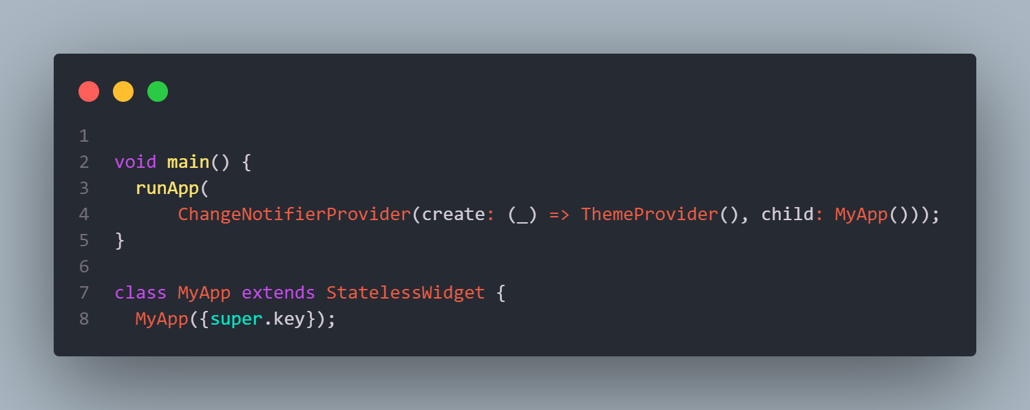
Also, ensure to wrap the themeMode and theme field with the provider object like so. This ensures that all the pages of your application listen to the ThemeProvider class.

In the code snippet above.
themeMode : Provider.of<ThemeProvider>(context).themeMode...retrieves the current theme from theThemeProviderclass usingProvider.of().contextmethod.theme: Provider.of<ThemeProvider>.(context).themeMode== themeMode.dark…sets the theme of the app based on the current theme mode. If the app’s theme is dark, it uses a dark theme with specifications, usingcopywith(). If the theme is not dark, then it uses the default light theme.ThemeData().copyWithis used to specify and customize the colors to be displayed for the dark theme.
Connect The Logic to UI:
We are halfway through with our theme App. Now, it is time to connect all the logic to the UI. Remember to wrap the Scaffold with a Consumer widget. The consumer widget prevents unnecessary rebuilds and ensures that only the parts of the UI relying on the ThemeProvider state rebuild, when there’s a change in theme. It improves performance and maintainability.
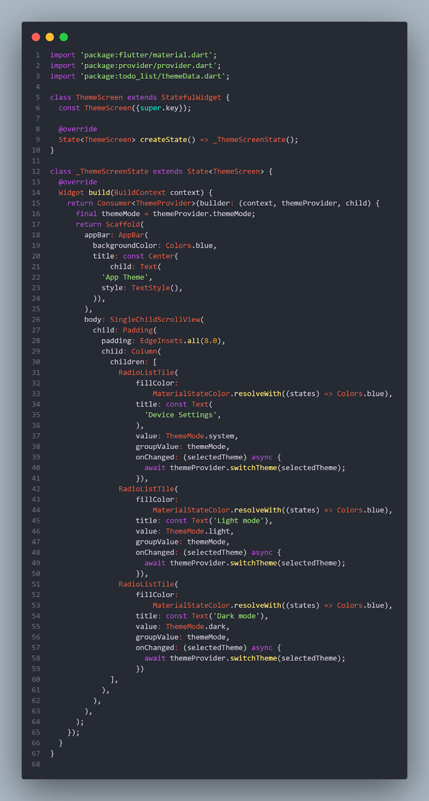
The code snippet above shows the UI of the Theme screen. Take note of the following:
A consumer widget is used to listen to and update changes in the material App, also in the build function, the variable themeProvider is used to hold the
ThemeProviderclass which is later called in theonChangeproperty.For each
RadioListTile(), theThemeMode.sytem, light, and dark are used respectively to determine the modes to be used by the application since we are using the dark theme feature.The
groupValueproperty takes in the themeMode variable as its value.The
onchangedfunction is made async because it is a future event to be awaited. It takes in theselectedThemeparameter and calls theswitchTheme()function.
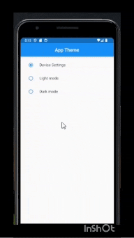
Now, you can hot restart your application, and voila!!! It works, yayy!!.

Source code; check this repo.
Conclusion:
Finally, we have created an app that allows users to easily switch between themes using provider and shared preferences. Provider and shared preferences when used together enhance user experience and efficiently manage app state.
If you found this tutorial helpful, comment or react, and follow me for more interesting articles. Ciao.